
life kit
life kit
life kit
Graphic Designer, UI/UX Designer
Graphic Designer, UI/UX Designer
Graphic Designer, UI/UX Designer
iOS App
iOS App
iOS App

Overview
Overview
The transition into adulthood can be stressful, and many young adults find themselves unprepared to handle emergencies or even basic household tasks when living independently for the first time. Nationwide surveys show that 72% of students lack confidence in skills like cooking, cleaning, and more. In these times, many turn to the Internet to help, but most only learn from firsthand experience, are unsure of where to start, and struggle to retain knowledge -- problems that a simple Google search cannot solve.
The transition into adulthood can be stressful, and many young adults find themselves unprepared to handle emergencies or even basic household tasks when living independently for the first time. Nationwide surveys show that 72% of students lack confidence in skills like cooking, cleaning, and more. In these times, many turn to the Internet to help, but most only learn from firsthand experience, are unsure of where to start, and struggle to retain knowledge -- problems that a simple Google search cannot solve.
How might we design a mobile application that provides a hands-on, approachable, and retentive method of learning life skills?
How might we design a mobile application that provides a hands-on, approachable, and retentive method of learning life skills?
Features
Features
In-app guides about life skills, with demos
Check-ins for review and retention
Notes and reminders
Blog-like community guides and tips
Tool/service borrowing
In-app guides about life skills, with demos
Check-ins for review and retention
Notes and reminders
Blog-like community guides and tips
Tool/service borrowing

Programs
Figma
Design Tool
Adobe Illustrator
Design Tool
Procreate
Illustration Tool
Programs
Figma
Design Tool
Adobe Illustrator
Design Tool
Procreate
Illustration Tool
Programs
Figma
Design Tool
Adobe Illustrator
Design Tool
Procreate
Illustration Tool
Year
Year
2026
Case Study & Demo
Case Study & Demo


Process
Process
Project Theme
Every quarter, UC Irvine's design organization, Design @ UCI, hosts an 8-week program where teams of 6 designers work on an app with a given theme, from ideation to prototype-complete. At the end, teams present to a panel of industry professionals.
In winter of 2026, I participated in Project Teams as a UI/UX and graphic designer. Given the theme of "Designing for the future," our team created life kit to teach college students adulting tasks, earning 1st place out of 9 teams.
Initial Ideation
Our team began with rapid ideation, mind mapping, and affinity mapping to explore potential app concepts. We initially pursued a political information and media literacy app, then pivoted to financial management for college students after project requirements changed. After two weeks of research and iteration, we pivoted once more and landed on our final concept: an app that teaches essential life skills to adolescents.
The idea was rooted in a gap we recognized in our own experiences: many students enter college without learning practical skills like car maintenance, cooking, and household chores. We saw an opportunity to design a resource that could help young people build confidence and independence when leaving home for the first time.
Wireframing
In our user research process, we collected 79 survey responses and conducted 5 interviews that we then referenced throughout our entire process. To consider different perspectives of how the app should work, each designer created low-fidelity sketches of a full flow, encompassing all of the app's main functions. We then discussed and compiled the most effective aspects of each flow for a more finalized and cohesive wireframe. From there, we distributed flows to each designer to flesh out into a functioning high-fidelity prototype. To keep the app design cohesive and intuitive, we reviewed each other's work and continue iterating based on such comments, as well as feedback from interviews and usability tests.
Project Theme
Every quarter, UC Irvine's design organization, Design @ UCI, hosts an 8-week program where teams of 6 designers work on an app with a given theme, from ideation to prototype-complete. At the end, teams present to a panel of industry professionals.
In winter of 2026, I participated in Project Teams as a UI/UX and graphic designer. Given the theme of "Designing for the future," our team created life kit to teach college students adulting tasks, earning 1st place out of 9 teams.
Initial Ideation
Our team began with rapid ideation, mind mapping, and affinity mapping to explore potential app concepts. We initially pursued a political information and media literacy app, then pivoted to financial management for college students after project requirements changed. After two weeks of research and iteration, we pivoted once more and landed on our final concept: an app that teaches essential life skills to adolescents.
The idea was rooted in a gap we recognized in our own experiences: many students enter college without learning practical skills like car maintenance, cooking, and household chores. We saw an opportunity to design a resource that could help young people build confidence and independence when leaving home for the first time.
Wireframing
In our user research process, we collected 79 survey responses and conducted 5 interviews that we then referenced throughout our entire process. To consider different perspectives of how the app should work, each designer created low-fidelity sketches of a full flow, encompassing all of the app's main functions. We then discussed and compiled the most effective aspects of each flow for a more finalized and cohesive wireframe. From there, we distributed flows to each designer to flesh out into a functioning high-fidelity prototype. To keep the app design cohesive and intuitive, we reviewed each other's work and continue iterating based on such comments, as well as feedback from interviews and usability tests.
Project Theme
Every quarter, UC Irvine's design organization, Design @ UCI, hosts an 8-week program where teams of 6 designers work on an app with a given theme, from ideation to prototype-complete. At the end, teams present to a panel of industry professionals.
In winter of 2026, I participated in Project Teams as a UI/UX and graphic designer. Given the theme of "Designing for the future," our team created life kit to teach college students adulting tasks, earning 1st place out of 9 teams.
Initial Ideation
Our team began with rapid ideation, mind mapping, and affinity mapping to explore potential app concepts. We initially pursued a political information and media literacy app, then pivoted to financial management for college students after project requirements changed. After two weeks of research and iteration, we pivoted once more and landed on our final concept: an app that teaches essential life skills to adolescents.
The idea was rooted in a gap we recognized in our own experiences: many students enter college without learning practical skills like car maintenance, cooking, and household chores. We saw an opportunity to design a resource that could help young people build confidence and independence when leaving home for the first time.
Wireframing
In our user research process, we collected 79 survey responses and conducted 5 interviews that we then referenced throughout our entire process. To consider different perspectives of how the app should work, each designer created low-fidelity sketches of a full flow, encompassing all of the app's main functions. We then discussed and compiled the most effective aspects of each flow for a more finalized and cohesive wireframe. From there, we distributed flows to each designer to flesh out into a functioning high-fidelity prototype. To keep the app design cohesive and intuitive, we reviewed each other's work and continue iterating based on such comments, as well as feedback from interviews and usability tests.
Design Decisions
We wanted to incorporate a mascot to make the experience more approachable and guide users as they learn new life skills. As a team, we explored a range of concepts, from a poker card jack representing a "jack of all trades," to a monkey that could reflect a more human-like experience. Building on these ideas, I proposed an octopus as our mascot. An octopus has multiple arms, each handling a different task, representing how our users will learn how to handle many different tasks by using life kit. This concept resonated with our team, as it provided a strong visual identity and a meaningful metaphor that the user can easily relate to.
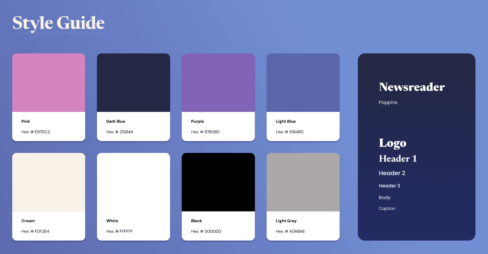
For our colors, I referenced our octopus mascot as inspiration and proposed an ocean-themed palette. This led us to explore a more cohesive system focused on shades of blue and purple. The team agreed on this direction, and to improve contrast and accessibility, we introduced pink and cream as accent colors.
In our mid-fidelity drafts, we explored both light and dark mode directions. Ultimately, however, we chose a dark blue background to reinforce the ocean theme, creating the feeling of navigating through a vast ocean. For typography, we selected Newsreader, a slightly stylized serif for headings and the logo, paired with Poppins, a cleaner sans serif, for body text to ensure readability.
Design Decisions
We wanted to incorporate a mascot to make the experience more approachable and guide users as they learn new life skills. As a team, we explored a range of concepts, from a poker card jack representing a "jack of all trades," to a monkey that could reflect a more human-like experience. Building on these ideas, I proposed an octopus as our mascot. An octopus has multiple arms, each handling a different task, representing how our users will learn how to handle many different tasks by using life kit. This concept resonated with our team, as it provided a strong visual identity and a meaningful metaphor that the user can easily relate to.
For our colors, I referenced our octopus mascot as inspiration and proposed an ocean-themed palette. This led us to explore a more cohesive system focused on shades of blue and purple. The team agreed on this direction, and to improve contrast and accessibility, we introduced pink and cream as accent colors.
In our mid-fidelity drafts, we explored both light and dark mode directions. Ultimately, however, we chose a dark blue background to reinforce the ocean theme, creating the feeling of navigating through a vast ocean. For typography, we selected Newsreader, a slightly stylized serif for headings and the logo, paired with Poppins, a cleaner sans serif, for body text to ensure readability.
Design Decisions
We wanted to incorporate a mascot to make the experience more approachable and guide users as they learn new life skills. As a team, we explored a range of concepts, from a poker card jack representing a "jack of all trades," to a monkey that could reflect a more human-like experience. Building on these ideas, I proposed an octopus as our mascot. An octopus has multiple arms, each handling a different task, representing how our users will learn how to handle many different tasks by using life kit. This concept resonated with our team, as it provided a strong visual identity and a meaningful metaphor that the user can easily relate to.
For our colors, I referenced our octopus mascot as inspiration and proposed an ocean-themed palette. This led us to explore a more cohesive system focused on shades of blue and purple. The team agreed on this direction, and to improve contrast and accessibility, we introduced pink and cream as accent colors.
In our mid-fidelity drafts, we explored both light and dark mode directions. Ultimately, however, we chose a dark blue background to reinforce the ocean theme, creating the feeling of navigating through a vast ocean. For typography, we selected Newsreader, a slightly stylized serif for headings and the logo, paired with Poppins, a cleaner sans serif, for body text to ensure readability.

Final Design
Our final app design centered around two main sections: in-app guides created by life kit, and community features. The life kit guides covered a variety of important life skills, such as vehicle maintenance chores, and finance. To improve interactivity and retention, animated demos and check-in quizzes are included for each guide. Users can also intuitively annotate and create notes, and set autofill or custom reminders. In the community page, users can view and post community guides/tips (as many survey respondents discussed their preference for taking life advice from other people that have experienced the same situations), as well as borrow tools and services from fellow nearby students for college-verified users.
Reflections and Future Changes
Facing a two-week setback on our app concept, we learned that no idea is a bad idea, and developed our skills in brainstorming and ideation. Once we established a solid foundation for our new direction, we found that user feedback was our most effective tool for making improvements. Holding regular meetings and communicating frequently with each other helped keep us on track.
In the future, if we were to expand this project beyond the scope of an 8-week design competition, we would like to integrate a rating system for services, borrowing, and community guides, which would allow users direct input on what helped them most.
life kit's goal is to provide curated support for its users. We chose the features and components that would be most beneficial to new adults using the app while prioritizing a clear and intuitive layout.
Final Design
Our final app design centered around two main sections: in-app guides created by life kit, and community features. The life kit guides covered a variety of important life skills, such as vehicle maintenance chores, and finance. To improve interactivity and retention, animated demos and check-in quizzes are included for each guide. Users can also intuitively annotate and create notes, and set autofill or custom reminders. In the community page, users can view and post community guides/tips (as many survey respondents discussed their preference for taking life advice from other people that have experienced the same situations), as well as borrow tools and services from fellow nearby students for college-verified users.
Reflections and Future Changes
Facing a two-week setback on our app concept, we learned that no idea is a bad idea, and developed our skills in brainstorming and ideation. Once we established a solid foundation for our new direction, we found that user feedback was our most effective tool for making improvements. Holding regular meetings and communicating frequently with each other helped keep us on track.
In the future, if we were to expand this project beyond the scope of an 8-week design competition, we would like to integrate a rating system for services, borrowing, and community guides, which would allow users direct input on what helped them most.
life kit's goal is to provide curated support for its users. We chose the features and components that would be most beneficial to new adults using the app while prioritizing a clear and intuitive layout.
Final Design
Our final app design centered around two main sections: in-app guides created by life kit, and community features. The life kit guides covered a variety of important life skills, such as vehicle maintenance chores, and finance. To improve interactivity and retention, animated demos and check-in quizzes are included for each guide. Users can also intuitively annotate and create notes, and set autofill or custom reminders. In the community page, users can view and post community guides/tips (as many survey respondents discussed their preference for taking life advice from other people that have experienced the same situations), as well as borrow tools and services from fellow nearby students for college-verified users.
Reflections and Future Changes
Facing a two-week setback on our app concept, we learned that no idea is a bad idea, and developed our skills in brainstorming and ideation. Once we established a solid foundation for our new direction, we found that user feedback was our most effective tool for making improvements. Holding regular meetings and communicating frequently with each other helped keep us on track.
In the future, if we were to expand this project beyond the scope of an 8-week design competition, we would like to integrate a rating system for services, borrowing, and community guides, which would allow users direct input on what helped them most.
life kit's goal is to provide curated support for its users. We chose the features and components that would be most beneficial to new adults using the app while prioritizing a clear and intuitive layout.